2012年11月8日星期四

Final Presentation and brief summary

Final posters:

 
Major ideas kept from the beginning:
Due to the site location and characters of the surrounding context, make the site and the buildings a continuation of two different characters of Parramatta (green area of park and developed modern urban area).
Divide the site into different parts due to their function, circulation, privacy and activities.
Different ways of composition of boxes on the site.
  
Brief progression-formation of the final design:
In the conceptual design, different buildings were linked together, later it becomes separate boxes distributed in the site, Then I divided them into two different groups of buildings contain different open spaces, but have little relationship in between.
 
The final design is still two groups of buildings. I locate the secondary buildings(brick boxes, same material is used next to the street in the green area)in the park covered by roof, with the forest run though the buildings. These buildings do not need to attract the public, but they still need to provide the users comfortable working space. I tried to achieve this by build large glazing windows faces interior walk pathes where the trees and grass run through, hence bring the park and green space into the site, create a quiet atmosphere suitable for work.
 
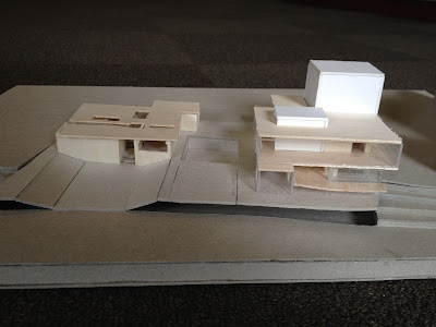
Closer shot of 1:500 model, shows level changes and openings of the private use area.
 
Rendering represents the idea of merge the forest and park into the building site.
 
 
The other side faces Church Street is another group of buildings of public usage. The reception and commercial buildings were placed on ground level with a gathering space in the center, which has got different choice of access. Because the site is large and most of people come to the theatre straight forward to watch the show, I think there must need to have something that can attract visitors to walk around and to experience the building and the site, and I tried to achieve this by build glazing boxes, lift the exterior dining space of restaurant, arrange minor circulation paths run through these boxes and allow the staircase forms a bridge connect the lower level and the theatres in the upper level. I aimed to provide rich visual and physical access , by viewing different activities taking place in different boxes(dining, shopping, working in workshops and people relax in the green open spaces).
At the same time, because this site have an interesting character, different side of this site faces different view(river, park, busy city), I designed a walk path surrounds the theatres on the upper level, which is like a glazing box, allow visitors to experience this difference in the waiting time.
At the same time, when people approach the building from the bridge, they can view different people doing different thing on the site, also arouse the citizens' interest and attract people to come the theatre, provides a changing picture to the city.
 
 Renderings, represent visual and physical relationship between the boxes(glazing and solid), circulation path and activities taking place.
 

1:100 sectional model
sectional view(cut the small theatre and public space of ground level)
 
View from open theatre.


Closer shots showing relationships in between.
 
View from the river.
 
1:500 site model
 
View from the river.


Closer shot of the theatre building.

Extract of study notes in the last few weeks:


Current feedback:
  • Model and drawings need to support and represent the design ideas. My model and drawing need to be developed, for example add trees, model the bridge connects northern and southern Parramatta, use proper material to build the facade of the theaters to further represent my ideas.
  • It is better to give the open theatre a cover to provide a better usage.
  • The site should have more physical interaction with the river, the slope of the park could start from open public space to give more connection with the river.
  • The design ideas were changed quite a lot during the semester, I still need to work few weeks on this project to develop the design, for example forest in the buildings.

Summary:
I learnt a lot from this project by trying different ideas, but next time it is better to try to develop one idea and keep working on that. It is a interesting experience that tring different ways to arrange and compose these simple boxes on the site and tried to develop a relationship in between by using different strategies. I also learnt how to develop hierarchy, and I still need to work on this in the future.
I will try to import character of the site contour into my design next time.
I think I should study and improve my ability on arrangement of the poster and how to organise the presentation to support the design and present my work in a better and more efficient way.
By looking at other studnets' work, I found it is helpful to build prograssion models and keep them(I always destroyed them or take some part off from the previous progression model and use it to make a new one), because keep refering back to the previous work really helps a lot.


2012年10月5日星期五

Project 3 Part 2

Final poster:
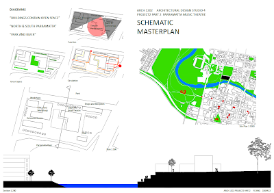
Circulation: 3 Entries, one major entry and two minor entries. Circulation path from red to yellow: public circulation to less public & private circulation.
 
The site is divided into 3 main areas: Most public area faces Church Street, Theatre performance area in the middle, and less public area where workshops, rehearsal rooms and stuff rooms located.
 
Ideas developed from last 2 weeks:
Open spaces: From Project1 I learnt that in the initial planing of Parramatta, only the most important buildings (eg. Church and Government House) had been given a open space around to emphasize their importance. In this Project I tried to emphasize the main open space where the main entrance is located, which is defined by the main theatre building and some commercial buildings, and secondary open space faces the park and contained by the small theatre and the rehearsal space, The third one in the workshop buildings and stuff rooms which has some curved walk path run through for private access. Also, use elements such as shelter to help reinforced the space (shown in process drawing below) and create a progression of entering and approach to the theatre building. Ideas of building site forms continuation of park and commercial area of Parramatta (building form, visual access, atmosphere) have been continued.
 
Process sketches of main open space: Buildings have layers of importance, drive the public's attention to the main building.

Progression of entering the main the site and getting involved into the building.
 
Secondary open space, buildings around have equal importance, mainly for gathering.


Model:


Current feedback:
 
Model and drawings are weak, should make detail model rather than volumetric model. It is hard to find clues of design ideas explained above.
 
Need to further develop hierarchy of open space, and the open spaces need to be clearly defined.
 
Be careful with the arrangement of poster (site plan was given too much space).
 
Start thinking about interior planing.


2012年9月13日星期四

Project 3 Part 1

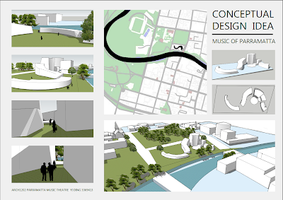
Main concept: Bring the characters of Parramatta and the idea of music into the building.
 
Final poster:
 
Conceptual models:
 
 
Relation to the site: Building is outstanding in the city but forms a representation of Parramatta city context (urban density, geometry, etc.)

 
Space: buildings define large open spaces. Narrow entries between high-rise buildings.


Circulation:
  • There are 2 main entries, one from the Church street and divided into 2 choices of access: straight to the theatre or walk through the park area. The other main entries faces Prince Alfred Park.
  • Smaller entries to the theatre.
Other ideas:
Form and Space:
  • Flowing shape to represent music.
  • Narrow entries to large open space, contrast in views(shown in bottom left of the poster).
Relation to site:   
  • Geometrical connection to Parramatta river.
  • High rise theaters face Church street are continuation and representation of urban area of Parramatta. Workshops and cafe spread in the park forms continuation of the park and green space nearby, and the open theatre faces the river. Thus to bring the characters of Parramatta city into the design and to achieve balance between the site and surrounding context, eg. visual balance, transition of urban density and natural/modern feel on the site, etc.
 
Ideas from precedent study (Music Center in Rome by Renzo Piano):
Buildings are outstanding but compromise between site and the city.
Geometrical relationship between the site and river.
Contrast between building scale and human scale.
Merge the idea of music and the building into one. 
 
Current feedback:
  • The building should have stronger response to the main urban area of Parramatta to achieve the concept, not just follow the adjacent building pattern.
  • It is not necessary to repeat the shape of river.
  • A curving shape of building in plan does not represent the idea of music. And music does not have to be flowing.
  • The building needs stronger connection to the river.
  • Develop the ideas, not just repeat them.
  • Layers are important in the building, such as major and minor circulation; progression of buildings.


2012年8月23日星期四

Project2 Auditorium Parco Della Musica

CONCERTINA BOOK - THINKING PROCESS, FORM OF IDEAS:


1. circulation

 
2. acoustic analysis

3. geometry shape

4. space

5. Urban context
 
6. 3D Volumetric diagram

7. Volumetric relationship


FINAL PRESENTATION:


 Poster
 
 
1. Elevation, building in urban context
The site is about 40000 square meters, stands out in the very dense Rome urban context, suggests its importance to contemporary Rome culture and its distinct identity.


2. Site plan
The building's shape is like a semi circle, which forms a representation of the river, creates a harmony between the building and the site.
 
 
3. Section, human figure in the building
The black dot represents a human figure in the site, makes a contrast between the huge building scale. The height and huge scale causes the audiences a sense of overwhelming and a rise of spirit.


4. symmetrical relationship


5.6.7.  Repetition and alternation in geometry.
There is a lot repetition and alternation in geometry of the building, indicates harmony and melody of  music.


8.9. Similarity of geometry in plan and section.
The architect achieve this geometry not only in plan but also in section.


10. 11. By cutting a curved section through the volumes of the building, we get a section that seems flowing in its outline, like the rise and low in tone and volume of music. We see how did the architect 'composed' the music center like a piece of music, enriches the visitors' experience and the building itself.


12. Section shows alternation of volume in building.

13. Spaces
The opening space in the center is the most important space of the auditorium,the other building space is 'radiate' around it. The gray space is the closed music theatre and the gray space is the other open spaces.


14.15. Building pattern in 3D view
The lower diagram shows the general building pattern in Rome (buildings or walls surrounds a open space within them) and how the music center accommodates the surrounding urban context and Rome's historical identity by building 3 theatres around the lower opening space. 


16. Material diagram
Choices of materials are not so modern.


17. Circulation
We can see how the architect managed a large number of people's circulation in this huge site.